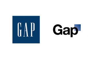
Ok, so I had to weigh in on this Gap logo debacle. I’ve been fascinated since they unveiled the new “modern” logo last week and have been watching the various opinions that have emerged. Yesterday, Gap made the announcement that they would go back to the old logo due to an overwhelmingly negative response online. I too am one of those, who helped beat the drum of “what were they thinking?”
 My question is how did they get this far and debut the logo without extensive market research? At first I thought this was a social media stunt – with @gaplogo tweeting hilarious one liners to all the haters – and then the addition of the crowdsourced approach announced late last week. What exactly was their goal here? The no press is bad press angle?
At this point, I’m over it – the logo is a mute point when it comes to the fact that it likely won’t stop me from shopping there from time to time should they keep the new logo. What’s your take?
Check out the Vanity Fair article about the situation here. Love it’s reference to Refinery29’s comment that the new logo is like “that awkward cap-sleeved tee with the rhinestone letters you find while thrift shopping that’s neither vintage nor new, but definitely not cool.” True fact.
Just heard on the news – the public outcry has forced them to change back. They will make sure they research before trying this again!